HVAC Websites – We Examine a Real Life Example of Our Highest Converting Mobile Page
According to Google’s own data, mobile is on the move. Mobile visitors have exceeded those of desktops and this trend is only increasing.

By Michael Haines – Founder of ACDirect.com
What does this mean for HVAC websites?
-
-
Mobile visitors can convert much better than desktop visitors or abandon your site in droves, depending on the experience you create
-
The mobile visitor’s expectation is very different than desktop users
-
Having a “responsive” site is killing your mobile conversions
Unfortunately, the mobile experience is not just poor, but non-existent for most contractor and HVAC websites.
In most cases, responsive websites do not provide the expedited journey that is needed for high conversion rates.
This can cost you hundreds of thousands of dollars in sales and you’ll never even know it. So, by taking advantage now of this weakness that exists in almost all markets for HVAC websites, you can turn the tide in your favor while your competition fails to capitalize.
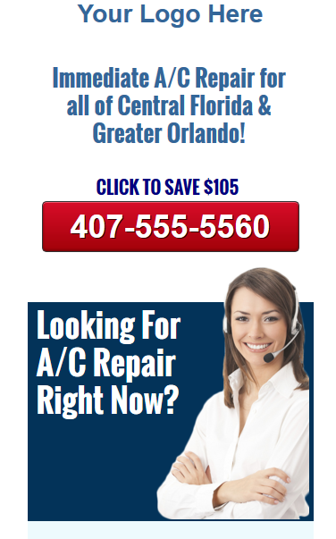
Let’s examine what a high converting mobile page looks like:
(This is a mobile page I designed for a PPC client)

Starting with the image above.
1. Logo at the very top of page
3. Followed by highly contrasted click to call button in case all they need is your phone number
4. Support the primary opening headline and reinforce your message
5. Insert a human image to create trust and a positive first impression

Next, create interest
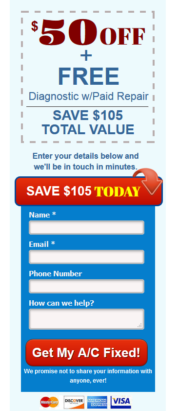
1. Make a compelling offer using a coupon format
2. Next, insert a colorful email lead generation box for those who prefer to contact you via email
3. The title of the box will read “Save $105” or “Let’s Get Started”
4. Require no more than 4 signup fields for simplicity
5. Don’t ever use the word “submit” in your signup button. Explain what they are about to receive by submitting the email. In this case, “Get My A/C Fixed”. I like a double call to action like this:
“Get My A/C Fixed & Save $105!”
6. Insert your privacy statement like shown above or try “100% Privacy Guaranteed”
7. Insert the forms of payment you accept.

Create desire by appealing to the stubborn and the skeptical
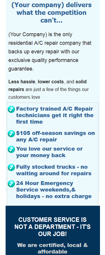
1. Give concise details of the benefits they will enjoy when they select you today
2. Insert 4-5 bullet points highlighting your best and most exclusive features AND benefits
3. Keep this section short and quickly scannable. Paragraphs should have no more than 4 lines each before a break
4. Insert your A+BBB logo, Angie’s List Super Service Award or other easily recognizable logos from awards you’ve won

Create the desire to take action
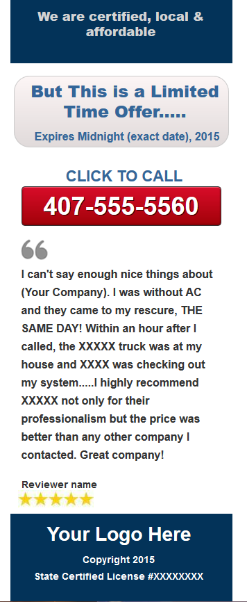
1. Make use of the proven “Scarcity Principle” with a looming deadline to react
2. Highlight this deadline followed by a click to call action
3. Insert a real customer testimonial
4. Your logo is next, followed by your state license number
Keep each page simple and focused on a single message, or consumer pain point. If your page is about A/C repair, don’t insert competing offers like duct cleaning, system replacements, etc.
Here’s what we’ve accomplished with this mobile page design.
Prospects looking for A/C repair will enjoy a fully optimized experience which includes these critical elements:
1. Strong opening headline let’s visitors know they are in the right place
2. There is no searching for the phone number. In fact, you encourage contact right when they arrive on your page
3. We give them an immediate reason to react by showing the savings offer right above the click to call button
4. The female image invokes a feeling of trust and creates a positive mood
5. The strong coupon offer outlines the complete offer for those that want to know a little more before they react
6. The email lead-gen box practically leaps off the page, enticing visitor action with clear instructions
7. The concise details and bullet points will appeal to those who may not be fully convinced quite yet
8. We create a sense of urgency with the offer expiration date
9. There are 2 click to call buttons and an email form, totaling 3 action indicators
10. As your visitors progress through the page, they are never far from a quick and easy way to contact you
Did I miss something? I would love to hear your thoughts and feedback! Have you tried something on your mobile pages that improved conversions. Leave your comments below.
This article is written by Michael Haines, the founder of AC Direct, the oldest and most visited HVAC e-commerce site in the country. Michael has generated over $40,000,000 in HVAC revenue using web based marketing from his own HVAC websites, including local service and installation sites.
His websites have generated over 17,000,000 visitors and were featured in the INC 5000 list of fastest growing companies in America, 2 years in a row.
Please contact us directly at:
407-459-8804 or email info@TripleYourClicks.com.com

